Walking into a room bathed in varying shades of one color creates an impact that’s hard to replicate with multi-colored schemes. Monochromatic design isn’t about painting everything the same flat shade, it’s about layering tints, tones, and shades of a single hue to build visual interest without the chaos. This approach works whether someone’s tackling a bedroom refresh or a whole-home renovation, and it’s surprisingly forgiving for DIYers who get nervous around color wheels. The trick lies in knowing how to manipulate that one color and add dimension through texture, material, and lighting.
Table of Contents
ToggleKey Takeaways
- A monochromatic color scheme creates visual interest by layering tints, tones, and shades of a single hue rather than using one flat color throughout the space.
- The 60-30-10 rule for monochromatic design allocates the lightest tint for 60% of the space, a mid-tone for 30%, and the darkest shade for 10% to build depth and definition.
- Texture and material variety are essential in monochromatic interior design; mix matte with gloss, soft fabrics with hard surfaces, and different paint sheens to prevent a flat appearance.
- Natural light direction significantly impacts monochromatic color selection—cool colors thrive in north-facing rooms while warm tones work better with south-facing, direct sunlight.
- Monochromatic schemes solve color-matching paralysis and create calm, cohesive spaces that photograph well and feel larger, making them ideal for small rooms and DIY decorators.
- Within a monochromatic color scheme, incorporate patterns like stripes and geometric prints in the same color family to add visual variety without introducing competing hues.
What Is a Monochromatic Color Scheme?
A monochromatic color scheme uses one base hue across an entire space, varying it through lightness and saturation rather than switching to different colors. Think of it as taking a single paint chip strip and using every shade from that strip in one room.
This isn’t the same as painting walls, trim, and ceiling the same color and calling it done. True monochromatic design layers tints (the base color plus white), tones (the base color plus gray), and shades (the base color plus black) to create depth. A navy bedroom might feature pale sky-blue walls, slate-blue bedding, midnight-blue accent pillows, and charcoal-blue window treatments, all derived from blue.
Neutrals like grays, beiges, and whites technically count as monochromatic schemes when handled this way, though they’re often categorized separately. The same principles apply: layer warm grays with cool grays, mix in textured materials, and vary the saturation levels to avoid a flat, builder-grade look.
Why Choose a Monochromatic Design for Your Home
Monochromatic schemes solve two common DIY decorating problems: color matching paralysis and visual clutter.
When working within one color family, it’s nearly impossible to pick a “wrong” shade. That navy pillow will work with the powder-blue throw because they share the same base hue. This makes shopping for decor, paint, and textiles significantly less stressful, no more carrying around seven paint chips trying to decide if the sofa green matches the curtain green.
These schemes also create a sense of calm that’s tough to achieve with multiple competing colors. The eye doesn’t jump around the room looking for the next bright object. Instead, it moves smoothly through gradations of the same hue, which makes spaces feel larger and more cohesive. This quality makes monochromatic design especially effective in small rooms, open-concept layouts, or homes where someone wants a sophisticated look without hiring a designer.
From a practical standpoint, monochromatic rooms photograph exceptionally well, which matters for resale value or rental listings. They read as intentional and designed rather than haphazardly decorated over time.
How to Select the Perfect Base Color
Choosing the base color requires honest assessment of the space’s existing conditions, architectural features, natural light, and fixed elements like flooring or countertops.
Natural light quality matters more than quantity. North-facing rooms receive cool, indirect light that makes warm colors (reds, oranges, yellows) look muddy and cool colors (blues, greens, purples) appear crisp. South-facing rooms get warm, direct light that intensifies warm tones and can wash out cool ones. Test paint samples on multiple walls and observe them at different times of day before committing.
Fixed materials dictate color temperature. If the space has honey oak floors, brass fixtures, or travertine tile, a warm-based monochromatic scheme (taupe, warm gray, terracotta) will integrate better than a cool one. Similarly, rooms with existing colorful interior design elements like bold tile or cabinets should coordinate with those undertones.
Consider the room’s purpose. Blues and greens work well in bedrooms and bathrooms due to their calming properties. Warmer neutrals like beige or greige suit living areas where people gather. Designers on Home Bunch often recommend starting with a favorite piece, a rug, artwork, or upholstered chair, and pulling the dominant color from that.
Avoid trendy colors for permanent finishes like tile or cabinetry. Paint is easy to change: ripping out a millennial-pink bathroom isn’t.
Creating Depth with Tints, Tones, and Shades
Without intentional variation in lightness and saturation, a monochromatic room flattens into a one-note space that feels more like a paint store error than a design choice.
Follow the 60-30-10 rule adapted for monochromatic work: Use the lightest tint (your base color plus white) for 60% of the space, typically walls and large upholstered pieces. Apply a mid-tone version for 30%, curtains, accent chairs, smaller furniture. Reserve the darkest shade for 10%, throw pillows, artwork frames, decorative objects.
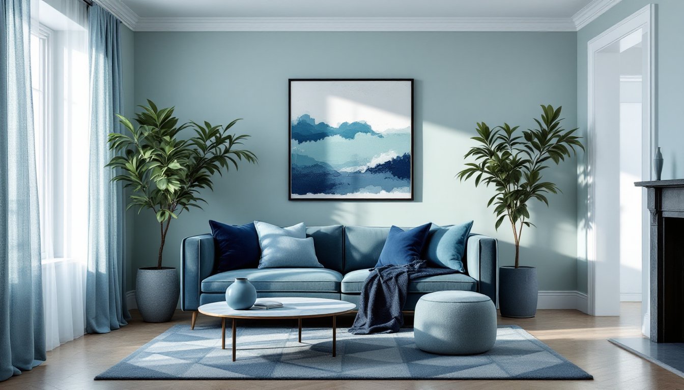
For example, in a green monochromatic living room, walls might be sage green (a light tint), the sofa in moss green (a mid-tone), and accent pillows in forest green (a dark shade). This creates visual movement without introducing new hues.
Don’t forget the fifth wall. Ceilings painted in the lightest tint of the base color unify the space without the bowling-alley effect of stark white. In a moody charcoal bedroom, a light gray ceiling prevents the room from feeling like a cave.
Use contrast strategically. Even monochromatic schemes need value contrast, the difference between light and dark, to define edges and create focal points. A pale blue room with white trim and white furniture disappears: the same room with navy trim and dark wood furniture has structure. Achieving harmony interior design requires balancing unity with enough variation to maintain interest.
Adding Texture and Pattern to Avoid Flatness
Texture does the heavy lifting in monochromatic spaces. Without it, rooms read as flat and unfinished, no matter how carefully the colors are layered.
Mix material finishes deliberately. Pair matte with gloss, rough with smooth, soft with hard. A gray room becomes dynamic when it includes linen curtains (matte, soft), a velvet sofa (matte, plush), marble side tables (glossy, hard), and a jute rug (rough, textured). Each material reflects light differently, creating visual interest without adding color.
Incorporate pattern within the color family. Geometric prints, stripes, florals, and abstract designs all work as long as they stay within the monochromatic palette. A navy room can handle navy-and-white striped pillows, a navy damask wallpaper accent wall, and solid navy throw blankets because the pattern provides variety without color competition.
Vary paint sheens across surfaces. Use flat or matte on ceilings to hide imperfections, eggshell or satin on walls for washability, and semi-gloss on trim and doors for durability and subtle contrast. The sheen difference catches light at different angles, adding dimension.
Layer textiles. Rooms featured on House Beautiful often showcase monochromatic spaces with six to eight different fabric textures, linen, velvet, cotton, wool, silk, chenille, all in the same color family. This prevents the “showroom” look where everything matches too perfectly.
If working with existing wood furniture, the grain provides natural texture. Don’t feel pressured to paint over it unless it clashes with the color temperature of the scheme.
Room-by-Room Monochromatic Design Tips
Each room type presents unique challenges and opportunities for monochromatic treatment.
Living Rooms
Living rooms benefit from mid-tone bases with plenty of textural variety. Use the largest pieces (sofa, area rug) in the base tone, then layer lighter tints on walls and darker shades in accessories. Incorporate wood tones that complement the color temperature, walnut and cherry for warm schemes, maple and ash for cool ones.
Safety note: If painting or refinishing furniture, work in a well-ventilated area and wear a respirator mask rated for VOCs, not just a dust mask. Most interior paints emit volatile organic compounds during application and cure time.
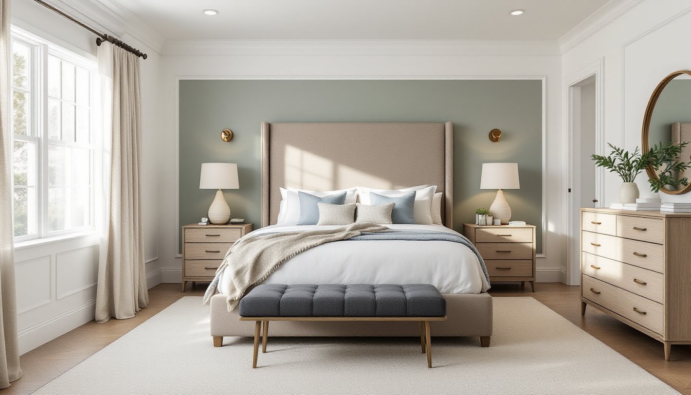
Bedrooms
Bedrooms can handle deeper, more saturated colors since they’re primarily used in low-light conditions. A charcoal or navy monochromatic bedroom that would feel oppressive in a living room creates a cocooning effect that promotes sleep. Balance dark walls with lighter bedding to avoid a cave-like feeling.
Layer bedding with different textures in the same color family: a cotton duvet cover, linen sheets, a velvet throw, and a chunky knit blanket all in varying shades of the base color.
Kitchens and Bathrooms
These rooms involve more fixed elements (cabinets, countertops, tile, fixtures), making pure monochromatic schemes trickier. Focus on what’s changeable: paint, textiles, and accessories. Elements of transition interior design can blend existing finishes with new monochromatic choices.
If the cabinets are staying, build the color scheme around them. White cabinets allow any monochromatic direction: wood cabinets require working with their undertones.
Use caution with trends. All-white kitchens and bathrooms show every speck of dirt and require constant maintenance. All-black versions hide dust but show water spots and fingerprints. Mid-tone monochromatic schemes (gray, sage, taupe) prove more forgiving for high-traffic areas.
Small Spaces and Hallways
Hallways, powder rooms, and closets are ideal testing grounds for bolder monochromatic choices. These transitional spaces can handle saturated colors that might overwhelm larger rooms. An emerald-green powder room or a terracotta hallway creates impact without requiring long-term commitment in primary living areas. Design ideas from Homedit often showcase how small spaces benefit from cohesive color treatments that would be too intense in larger rooms.
Conclusion
Monochromatic design strips away the complexity of color coordination while demanding more attention to texture, material, and light manipulation. It’s a forgiving approach for DIYers who want a designer look without the designer budget, as long as they resist the urge to play it safe with flat, uniform color application. Layer those tints and shades deliberately, pile on the textural variety, and the single-color space will deliver far more visual interest than a poorly executed rainbow.