Interior design isn’t about chasing trends or copying catalog spreads. It’s about making deliberate choices that turn a house into a home, one that works for how you actually live. Whether you’re planning a single-room refresh or a whole-home makeover, understanding core design principles saves you from costly mistakes and buyer’s remorse. This handbook walks through the essentials: color theory, space planning, room-specific strategies, budget-friendly DIY techniques, and the common pitfalls that trip up even experienced renovators. Think of it as your foundation, the practical knowledge that turns inspiration into action.
Table of Contents
ToggleKey Takeaways
- An interior design handbook provides practical frameworks and order-of-operations guidance that prevents costly mistakes and transforms vague design ideas into actionable steps for homeowners and DIYers.
- The 60-30-10 color rule and testing paint samples in multiple lighting conditions ensure a balanced palette that works with your space’s natural light and fixed elements like flooring and cabinetry.
- Strategic space planning with 36-inch primary walkways, properly scaled furniture, and floating elements away from walls creates functional conversation zones and makes rooms feel larger and more intentional.
- High-impact, low-cost DIY techniques like quality paint ($30–60 per gallon), hardware swaps, peel-and-stick solutions, and layered lighting deliver professional results without a large budget.
- Avoiding common interior design pitfalls—such as undersized rugs, single overhead lighting, poor traffic flow, and trend-chasing over timelessness—saves time, money, and prevents the need for costly do-overs.
- Prioritize function over aesthetics by designing spaces around how you actually live, from kitchen work triangles to blackout shades in bedrooms and ergonomic home office setups that support your daily activities.
What Is an Interior Design Handbook and Why You Need One
An interior design handbook is a practical reference that consolidates design principles, material specs, and decision-making frameworks into one guide. Unlike mood boards or style quizzes, it focuses on the mechanics: how to measure a room for furniture, select paint finishes that hold up to traffic, or balance proportions so a space doesn’t feel cramped or empty.
Homeowners tackling their own projects need this resource because design decisions stack. Choose the wrong sofa depth, and suddenly your traffic flow is blocked. Pick a bold wall color without testing samples in natural light, and you’re repainting in six months. A handbook prevents these missteps by laying out the order of operations and the reasoning behind each choice.
For DIYers, it’s also a confidence builder. Knowing the difference between accent lighting and task lighting, or understanding why a 8×10 rug anchors a seating area better than a 5×7, means you can walk into a home center or browse online with a clear plan. Many professional designers rely on established industry guidelines to ensure their projects meet both aesthetic and functional standards.
You don’t need formal training to design a livable, attractive home. But you do need a framework, something that turns vague ideas (“I want it to feel cozy”) into actionable steps (“use warm neutrals, layer textiles, add dimmable overhead lighting”). That’s what a handbook provides.
Essential Design Principles Every Homeowner Should Know
Before you buy a single throw pillow, grasp these foundational concepts. They apply to every room and every style, from farmhouse to mid-century modern.
Color Theory and Palette Selection
Color sets the mood, but it also affects perceived room size and light quality. Start with the 60-30-10 rule: 60% dominant color (walls, large furniture), 30% secondary color (upholstery, rugs, window treatments), and 10% accent color (pillows, artwork, accessories). This ratio prevents visual chaos and gives the eye a clear hierarchy.
When selecting a palette, test paint samples on at least two walls, one that gets morning light and one that gets afternoon or artificial light. Paint shifts dramatically depending on exposure. A soft gray can read blue in north-facing rooms or warm beige in south-facing spaces. Many colorful interior palettes succeed because they respect natural light and balance saturation with neutrals.
Undertones matter more than the color name on the can. Beige can have pink, yellow, or gray undertones. If your flooring has warm honey tones, a beige with cool gray undertones will clash. Pull samples of your fixed elements, flooring, countertops, cabinetry, and compare them against paint chips in natural light.
For DIYers nervous about bold color, try the “test wall” approach: paint one accent wall or even just the area behind a headboard. If it doesn’t work, you’ve only wasted a quart of paint, not four gallons.
Space Planning and Furniture Layout
Traffic flow is non-negotiable. Leave at least 36 inches of clearance for primary walkways and 24 inches for secondary paths. In a living room, that means sofas and chairs can’t block the route from the entry to the kitchen or hallway.
Start by measuring the room, length, width, ceiling height, and noting architectural features like windows, doors, radiators, or built-ins. Then measure your furniture (or the pieces you plan to buy). Sketch a floor plan to scale on graph paper, or use free online tools. This prevents the classic mistake of buying a sectional that physically fits but visually overwhelms the room.
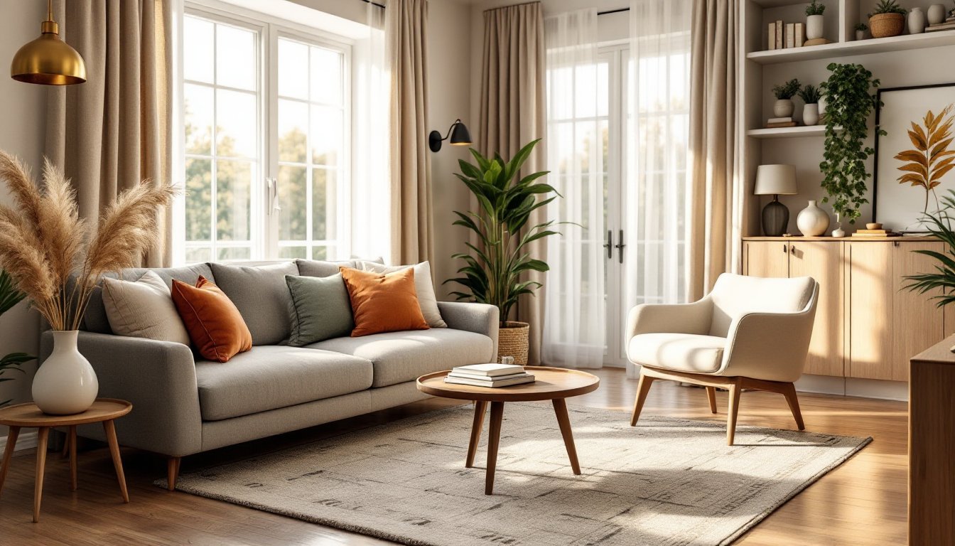
Furniture arrangement should create conversation zones. In a living room, seating pieces should be no more than 8 to 10 feet apart for comfortable conversation. Anchor seating areas with a rug large enough that at least the front legs of all furniture pieces sit on it, preferably all four legs for a cohesive look.
Don’t push all furniture against the walls. Floating a sofa a few feet off the wall can actually make a room feel larger by defining zones and adding depth. Leave 12 to 18 inches between a coffee table and seating for legroom and ease of movement.
Consider proportion and scale. A low-slung mid-century sofa pairs well with a sleek coffee table, but looks awkward next to a chunky farmhouse dining table. Match the visual weight of pieces within a room. Mixing styles works when the scale and proportions are consistent.
Room-by-Room Design Strategies for Your Home
Each room has unique functional requirements that shape design decisions. Here’s how to approach the most common spaces.
Living Room: This is your most flexible space, so start with its primary use. If it’s a TV-watching zone, orient seating toward the screen and plan for media storage. If it’s a conversation area, arrange seating in a U-shape or two facing sofas. Layered lighting is critical, combine overhead (ceiling fixture or recessed cans), task (reading lamps), and accent (picture lights, sconces). Dimmers are worth the $15 investment per switch.
Kitchen: Function trumps aesthetics every time. The classic work triangle, sink, stove, refrigerator, should total between 13 and 26 feet for efficiency. Countertop workspace between the sink and stove (at least 36 inches) is essential for prep. If you’re refreshing rather than renovating, focus on high-impact, low-cost changes: paint cabinets, swap hardware, upgrade lighting under cabinets, or install a peel-and-stick backsplash. For layout inspiration and balanced design approaches, consider how each element contributes to both workflow and visual appeal.
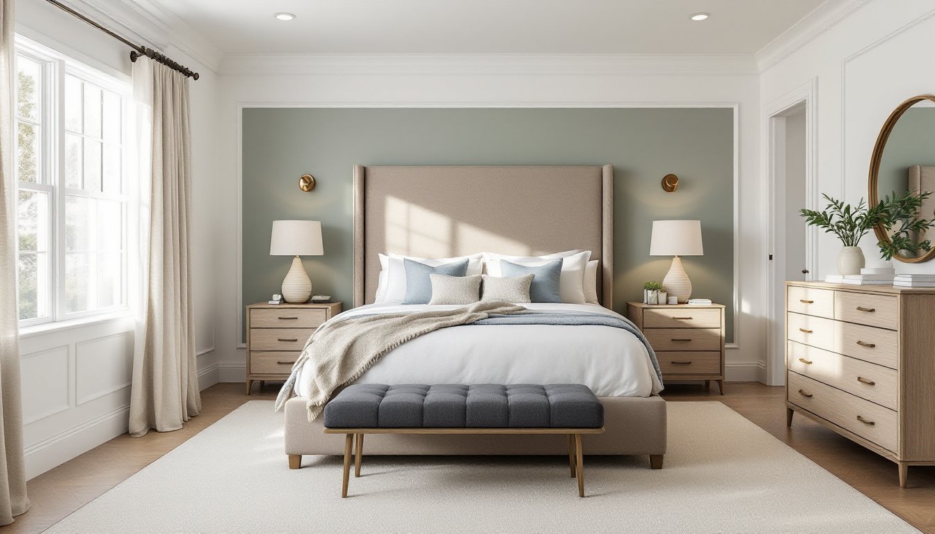
Bedroom: Prioritize the bed, it’s the room’s focal point. Ideally, place it on the wall opposite the door with nightstands on both sides (each at least 24 inches wide for a lamp and a book). Avoid placing the bed under a window if possible: it complicates window treatments and can create drafts. Blackout shades or lined curtains improve sleep quality. Keep pathways around the bed at least 24 inches wide.
Bathroom: Ventilation is non-negotiable to prevent mold. If there’s no window, install an exhaust fan rated for the room’s square footage (check the CFM rating). In a small bath, use large-format tiles (12×24 or larger) and minimize grout lines to make the space feel bigger. Wall-mounted vanities create the illusion of more floor space. If you’re painting, use satin or semi-gloss finish for moisture resistance.
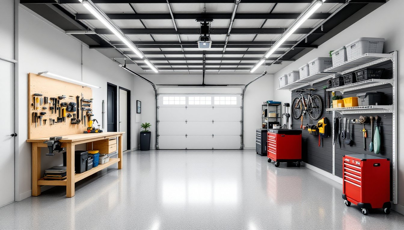
Home Office: Desk placement matters. Facing a wall can feel claustrophobic: positioning the desk perpendicular to a window provides natural light without screen glare. Invest in task lighting, a desk lamp with adjustable arm and at least 450 lumens for reading and computer work. Ergonomics aren’t design fluff: your monitor should be at eye level, and your chair should support your lower back. Built-in shelving or a pegboard system keeps supplies accessible without cluttering the desk surface.
Budget-Friendly DIY Techniques to Transform Your Space
You don’t need a five-figure budget to make a room feel intentional and polished. Focus on high-impact, low-cost projects that improve function and aesthetics.
Paint: Still the best ROI in home improvement. A gallon of quality interior paint covers roughly 350 to 400 square feet and costs $30 to $60. Prep work is everything, clean walls, fill holes with spackle, sand smooth, and prime if you’re going from dark to light or covering stains. Use painter’s tape on trim and remove it while the paint is still slightly tacky to avoid peeling. Two thin coats beat one thick coat every time.
Peel-and-Stick Solutions: Removable wallpaper, tile backsplashes, and vinyl flooring have come a long way. They’re ideal for renters or anyone testing a look before committing. Clean and dry the surface thoroughly before application, grease or dust will prevent adhesion. For backsplash tiles, use a level and start from the center, working outward to keep patterns symmetrical.
Hardware Swaps: Replacing cabinet pulls, doorknobs, or curtain rods takes minutes but changes the entire feel of a room. Matte black, brushed brass, and polished nickel are current favorites, but choose based on your existing finishes. Keep a consistent finish within a room (all brass or all nickel, not mixed).
DIY Shelving: Floating shelves add storage and display space without eating floor area. Use a stud finder to locate wall studs, drywall anchors aren’t sufficient for anything holding more than a few pounds. For a 36-inch shelf holding books, use at least two brackets rated for 50+ pounds each. Pine, poplar, or pre-finished MDF boards (¾-inch thick) are beginner-friendly and affordable. Sand edges smooth and apply polyurethane or paste wax for durability.
Textile Layers: Swapping throw pillows, blankets, or curtains is the fastest way to refresh a room. For cohesion, pull accent colors from your largest fixed element (a rug or sofa). Curtains should just touch the floor or puddle slightly for a tailored look: hang the rod 4 to 6 inches above the window frame to add height. Exploring approaches like opposition in design can help you mix textures and colors for dynamic visual interest.
Lighting Upgrades: Replace builder-grade fixtures with something that reflects your style. Pendant lights, sconces, and chandeliers are surprisingly DIY-friendly if you’re comfortable working with electrical (turn off the breaker first). If not, at least swap out lampshades, a $20 linen drum shade instantly elevates a thrifted lamp. When selecting design elements and making purchasing decisions, resources like MyDomaine’s styling guides can provide additional room-specific inspiration.
Common Interior Design Mistakes and How to Avoid Them
Even experienced DIYers fall into these traps. Knowing them upfront saves time, money, and frustration.
Ignoring Scale and Proportion: A common error is choosing furniture that’s too small for the room. A 72-inch sofa might seem big in the showroom but looks lost in a 16×20 living room. Conversely, cramming oversized pieces into a small space blocks traffic and makes the room feel claustless. Measure everything, including doorways and stairwells, before buying.
Poor Lighting: Relying on a single overhead fixture creates harsh shadows and an uninviting atmosphere. Layer your lighting, ambient (overhead or recessed), task (under-cabinet, desk lamps), and accent (picture lights, sconces). Dimmers give you control for different times of day and activities.
Skipping the Rug or Choosing the Wrong Size: A too-small rug makes a room feel disjointed. In a living room, the rug should extend at least 18 inches beyond the furniture on all sides, or have all furniture legs on it. In a dining room, the rug should extend 24 inches beyond the table edge so chairs don’t catch when pulled out. For room-specific furniture and decor ideas, platforms like Homedit offer practical layout examples.
Pushing All Furniture Against Walls: This doesn’t make a room feel bigger, it makes it feel like a waiting room. Float furniture to create zones and improve flow. Even pulling a sofa 12 inches off the wall and adding a console table behind it adds depth.
Neglecting Window Treatments: Bare windows can make a room feel unfinished and compromise privacy. Hang curtain rods close to the ceiling and extend them 6 to 12 inches beyond the window frame on each side. This makes windows appear larger and lets in maximum light when curtains are open. If you’re working within tight budgets or contracts, understanding professional standards, like those outlined in an interior design contract, can clarify scope and expectations.
Choosing Trends Over Timelessness: That viral TikTok trend might look great now, but will you still love it in three years? Invest in classic, neutral foundations (sofa, dining table, bed frame) and layer in trend-driven accessories (pillows, art, small decor items) that are easy and inexpensive to swap out. Styles that incorporate transitional design principles often balance current aesthetics with enduring appeal.
Forgetting Function: A beautiful room that doesn’t work for your lifestyle is a failure. If you have kids and pets, white linen sofas are impractical. If you cook daily, open shelving in the kitchen means constant dusting. Design for how you live, not how you wish you lived. Honest assessment upfront prevents regret and costly do-overs.